Redesigning Laskie, from every angle
Sole designer alongside four engineers. I worked across every side of Laskie’s tech-recruitment marketplace and let the deeper patterns surface from the work itself.
The Challenge
Laskie was a high-growth marketplace pairing engineering talent with tech companies — already live and shipping when I joined as sole designer. The brief was clear: take the priority work and keep the team shipping. The pace didn’t leave room for foundational research. The team had named the surface UI pains. The deeper patterns were still hidden in the day-to-day work.
The Approach
I worked the marketplace systematically — entry funnels, client side, candidate side, the internal recruiter platform — using the 80/20 rule to prioritize and tight cycles to ship. The deepest patterns only surfaced from doing the work, not before it.
- Systematic redesign across every side of the marketplace
- Eliminated the 30-minute “double input” tax recruiters paid per interview
- Earned the research that rebuilt the recruiter dashboard around real workflow
The Backlog
Taking the priority queue
Laskie connected three groups: clients hiring engineers, candidates looking for work, and the internal roles running the marketplace: Talent Partners and BizOps.
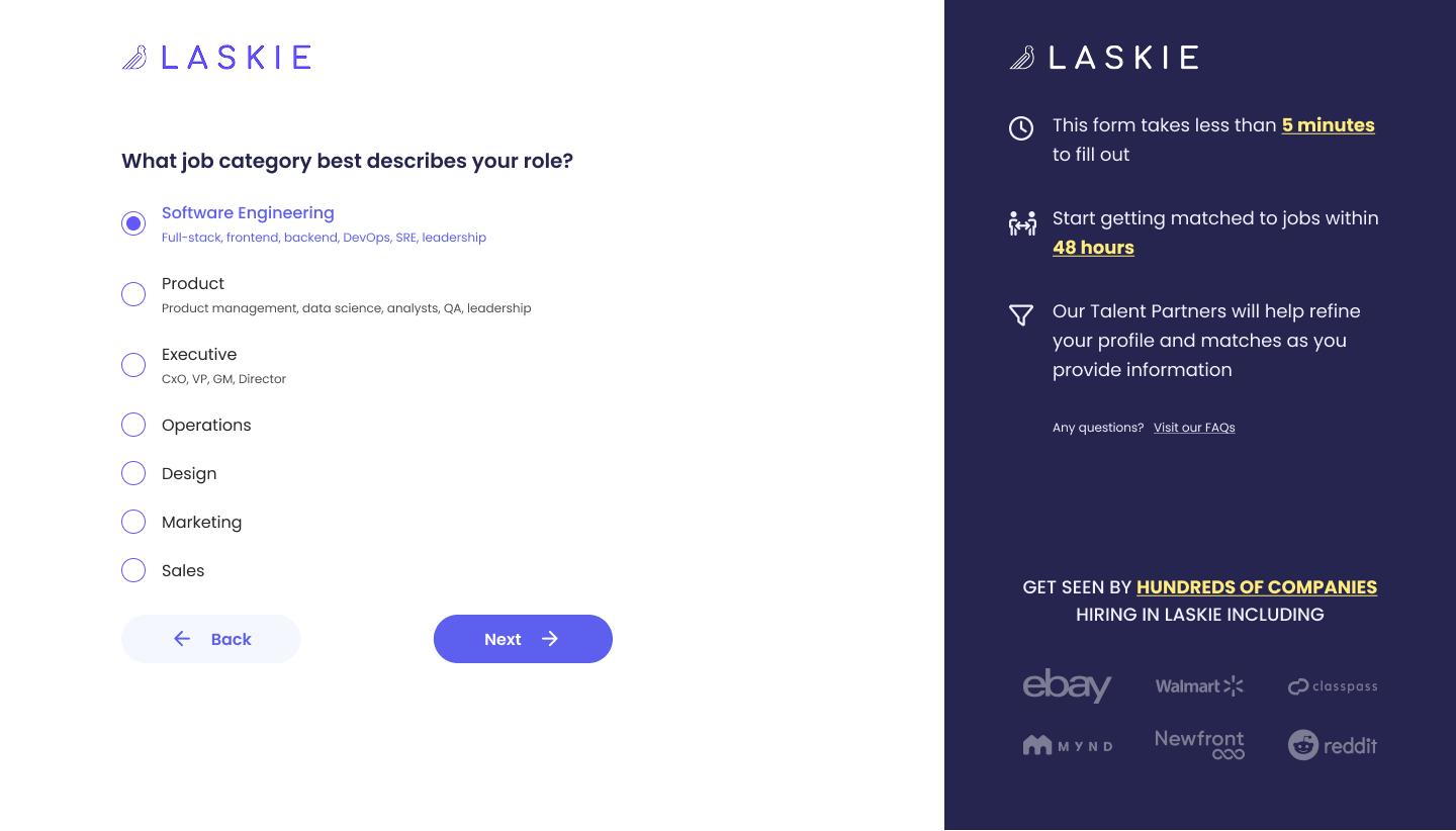
Redesigning the three entry funnels
Three doors, each shaped by who walks in: candidates applying, clients creating accounts, and job referrals from Laskie’s network. Each funnel asked only what was needed to get the right user to the right next step.
Rebuilding the client portal
The client portal handles the full hiring loop: setting up a company profile, building job postings, and managing the candidate pipeline. As candidates move through the pipeline, hiring managers can invite to interview, ask a clarifying question, or pass with structured feedback.
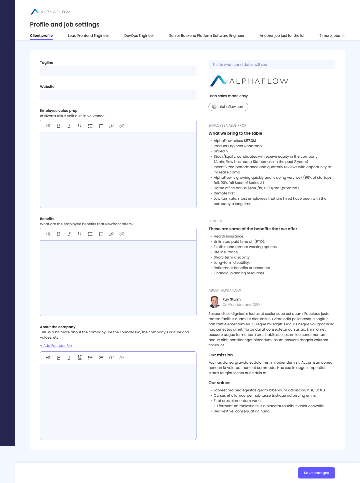 Click to view full builder
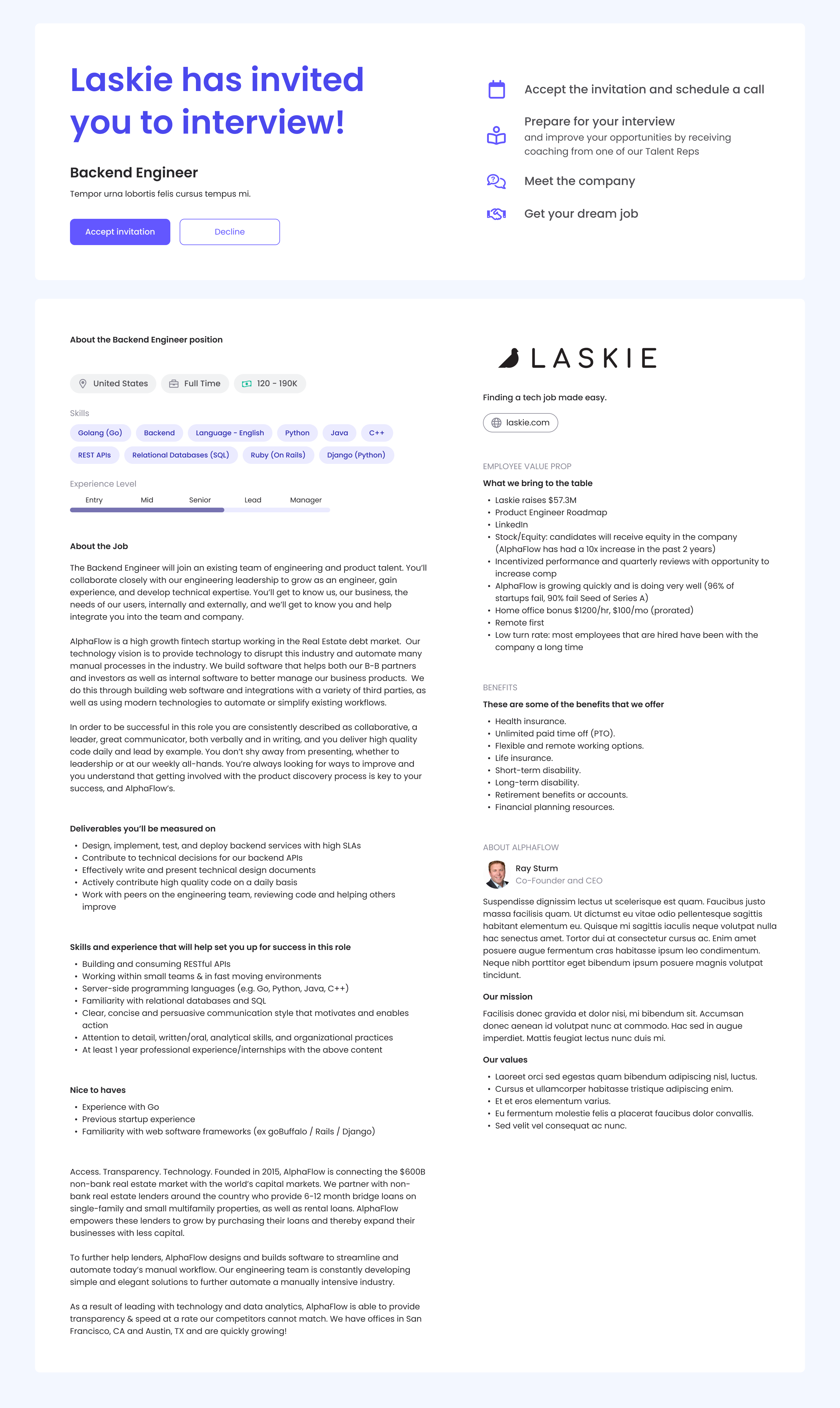
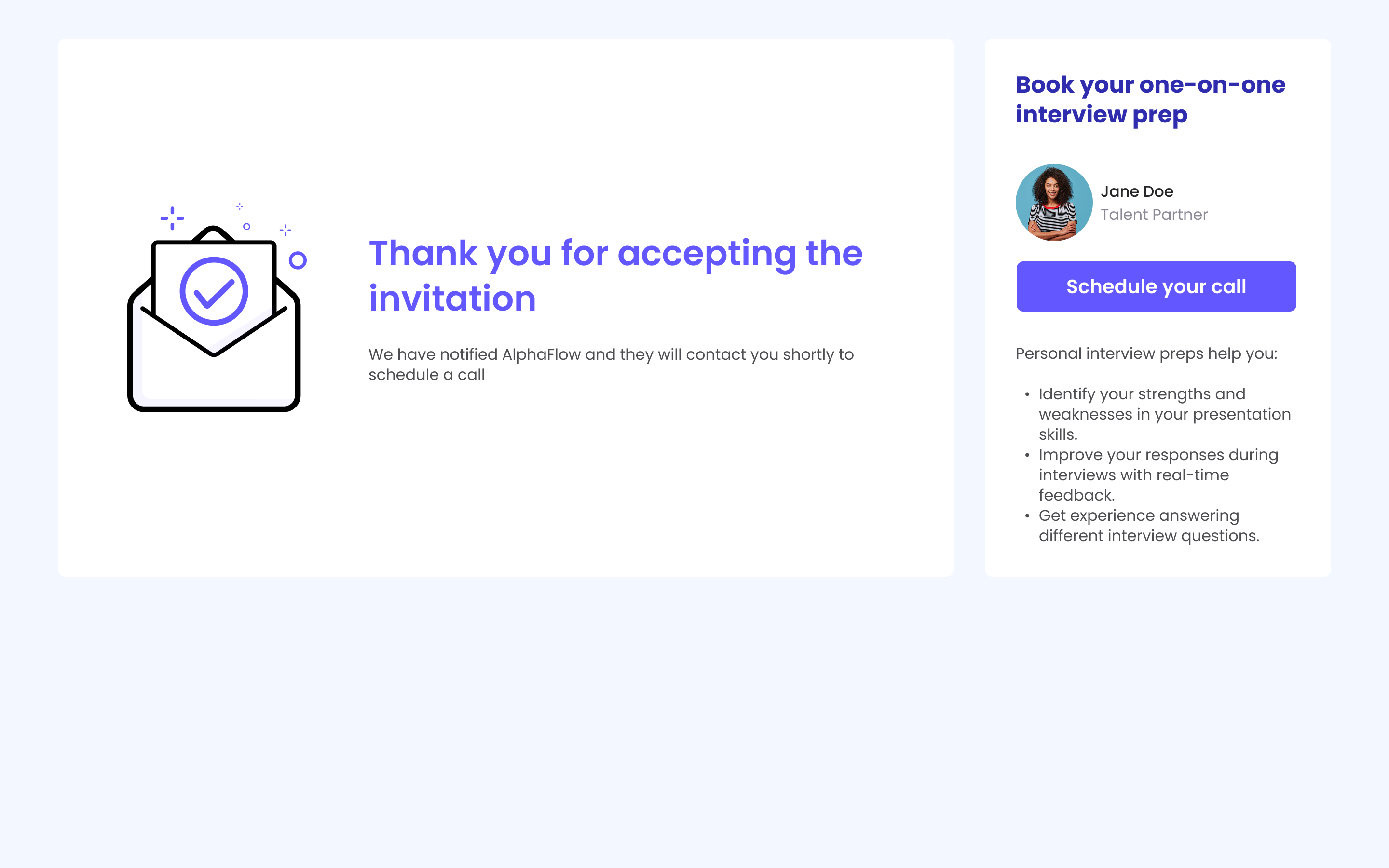
Reworking the candidate's invitation flow
Candidates encounter Laskie as a stream of opportunities. The redesign anchored the moment of decision: a landing page explaining who’s asking, why, and what’s next. Once they accept, the next step is already booked — a clear handoff with the option to schedule interview prep with their Talent Partner.
Click to view full landing
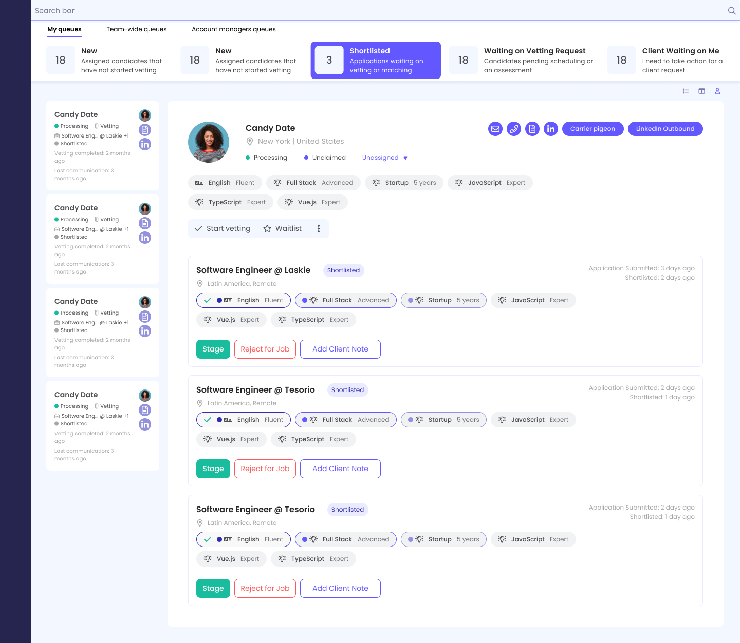
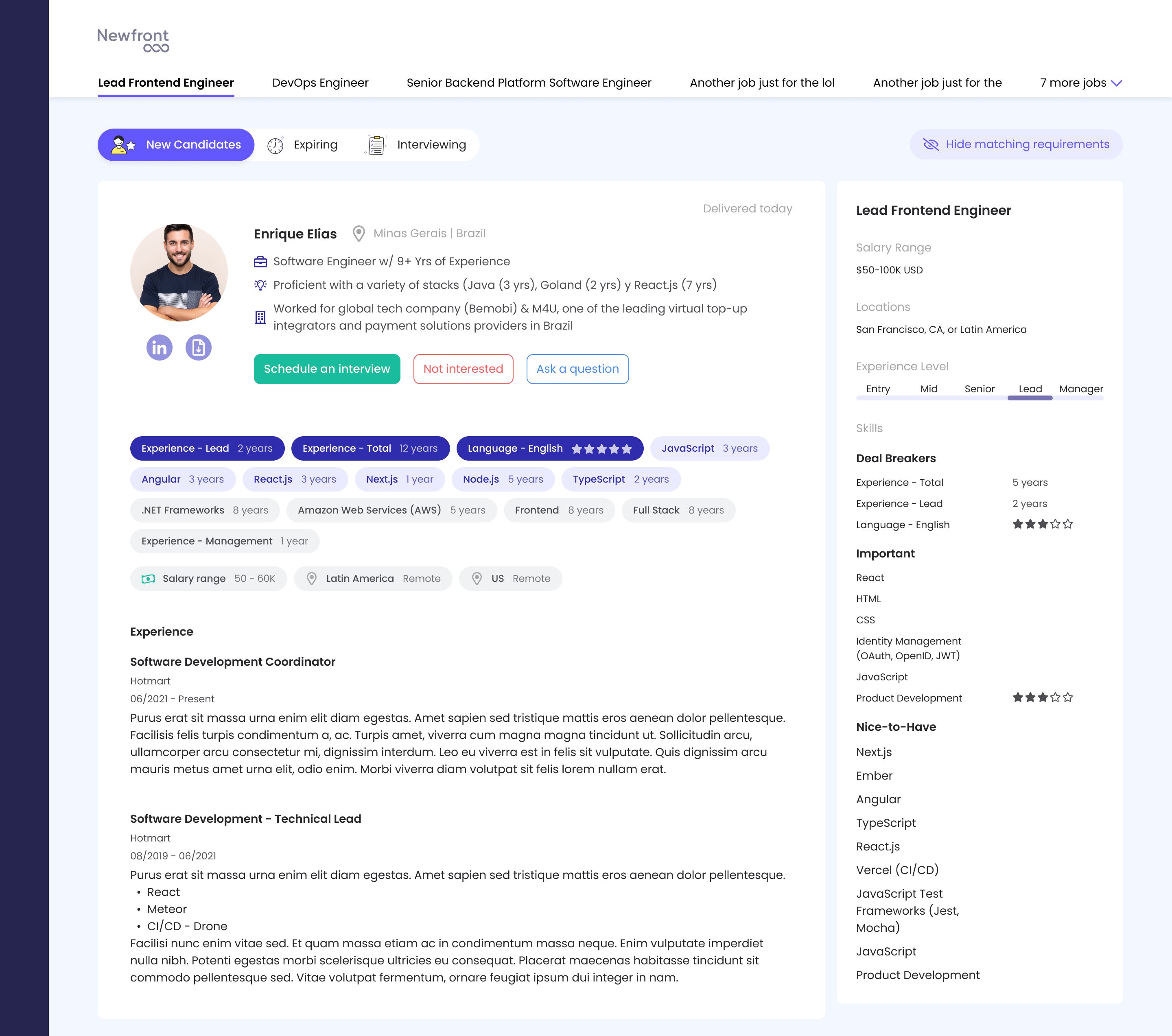
Redesigning the recruiter platform
Talent Partners and BizOps share one platform with role-aware access. BizOps sees everything Talent Partners do, plus an admin layer for managing client accounts.
The Talent Partner’s core job is matching candidates to jobs: good fit now, park for later, or move them to the next available role. The flow had enough branching that I drew the system first, then built.
 Click to view full profile
Output-optimized — built for scanning, not capturing.
Every candidate runs through this — Homing Pigeon sits inside it, with the AM as a mandatory second filter.
 Click to view full Homing Pigeon
Match or No Match — the per-job decision that calls the next step.
By the time I’d touched every side of the marketplace, a pattern was about to surface that none of these screens, by themselves, made obvious.
The Editor
Killing the double input.
While redesigning candidate Matching Data, a pattern surfaced. Talent Partners had been working around the platform for months — notes in Word during interviews, copy-pasted into Laskie afterward, section by section. The fix had been hiding inside the work I was already doing.
The pattern that was costing 30 minutes per call
The editor wasn’t built for a live interview’s rhythm, so Talent Partners ran a parallel system — quality slipped when fatigue did. The fix was a different premise: what if the editor served the call, not the database? Engineering and I restructured it for real-time note-taking with a Notes section for qualitative observations. The external tool walked out.
Before
- 1Call with the candidate
- 2Notes typed in Word or Google Sheets
- 3Call ends
- 4Notes manually copied into Laskie, section by section
+30 min every interview
After
- 1Call with the candidate
- 2Talent Partner types directly into Laskie
- 3Call ends — profile is ready
0 min extra
 Click to view full editor
Input-optimized — sectioned for the rhythm of a live call.
When the editor shipped, the three Talent Partners I re-interviewed post-launch confirmed the 30-minute tax was gone — the cleanest validation a designer can earn.
The Zoom-Out
What I couldn’t see while building.
With most of the marketplace redesigned, I went back to do formal research with the people who used the platform daily — not as the start of the project, but as a way to look back at what shipping had already taught me.
The wider workflow
I ran 45-minute interviews with three Talent Partners and two BizOps employees. Three threads carried every conversation:
- Step-by-step activity mapping Documented their daily flow on the platform so the team had a shared reality.
- Pain point discovery Located friction at every step and stress-tested possible fixes against their real constraints.
- Feature feedback Pulled direct reactions to the redesigned editor and surfaced gaps the team hadn’t seen.
I turned those calls into a shared process map in FigJam — a blueprint of the operational landscape, candidate side and job side. For the first time the team could see, in one place, where the workflow leaked.
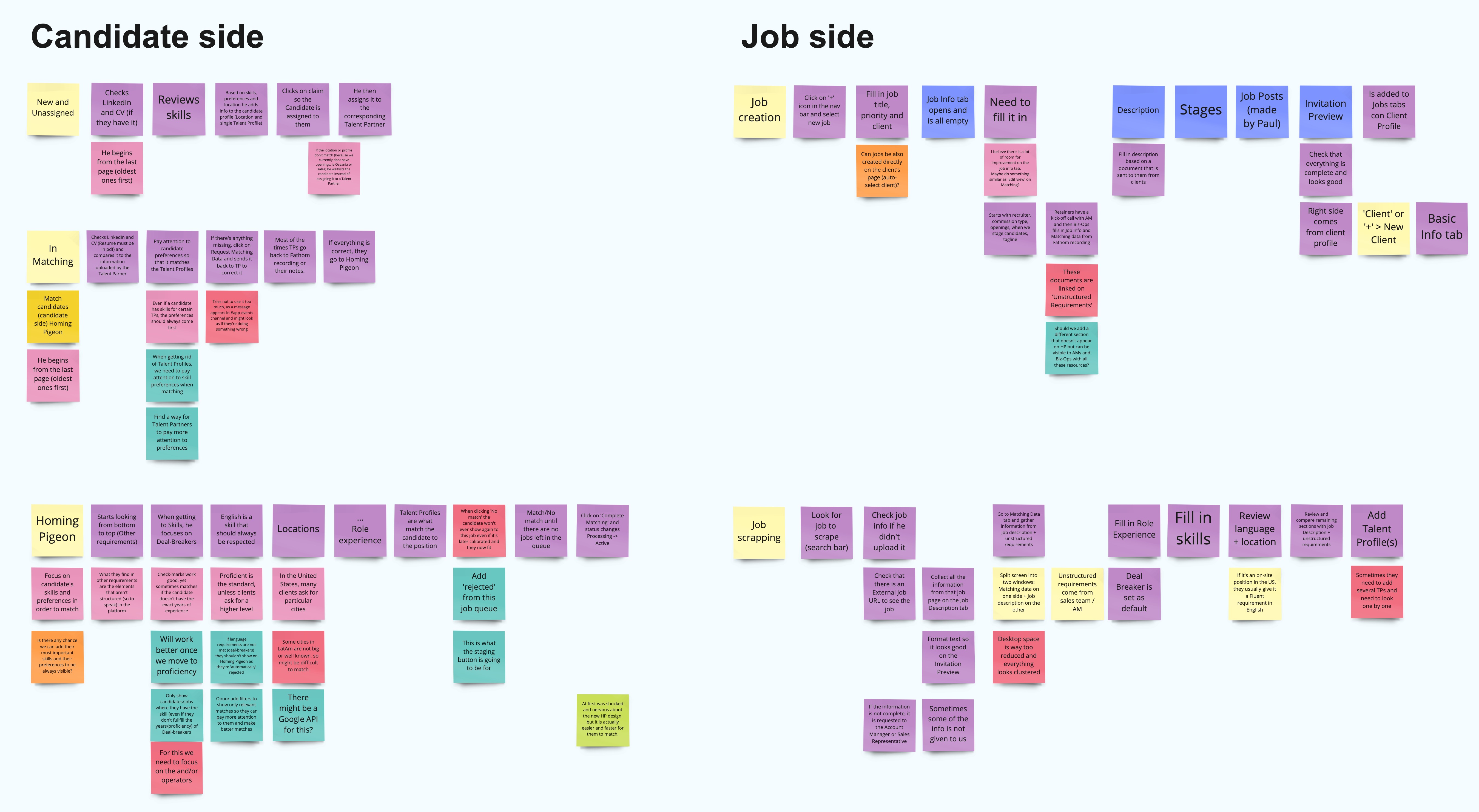
Each step in the flow is a place time can leak.
The funnel, finally legible
Talent Partners had per-stage views, but no top-level screen showing what needed attention first. The dashboard added that view: every stage with a count, every status one click from drilling in. The funnel that lived in a recruiter’s head finally had a home.
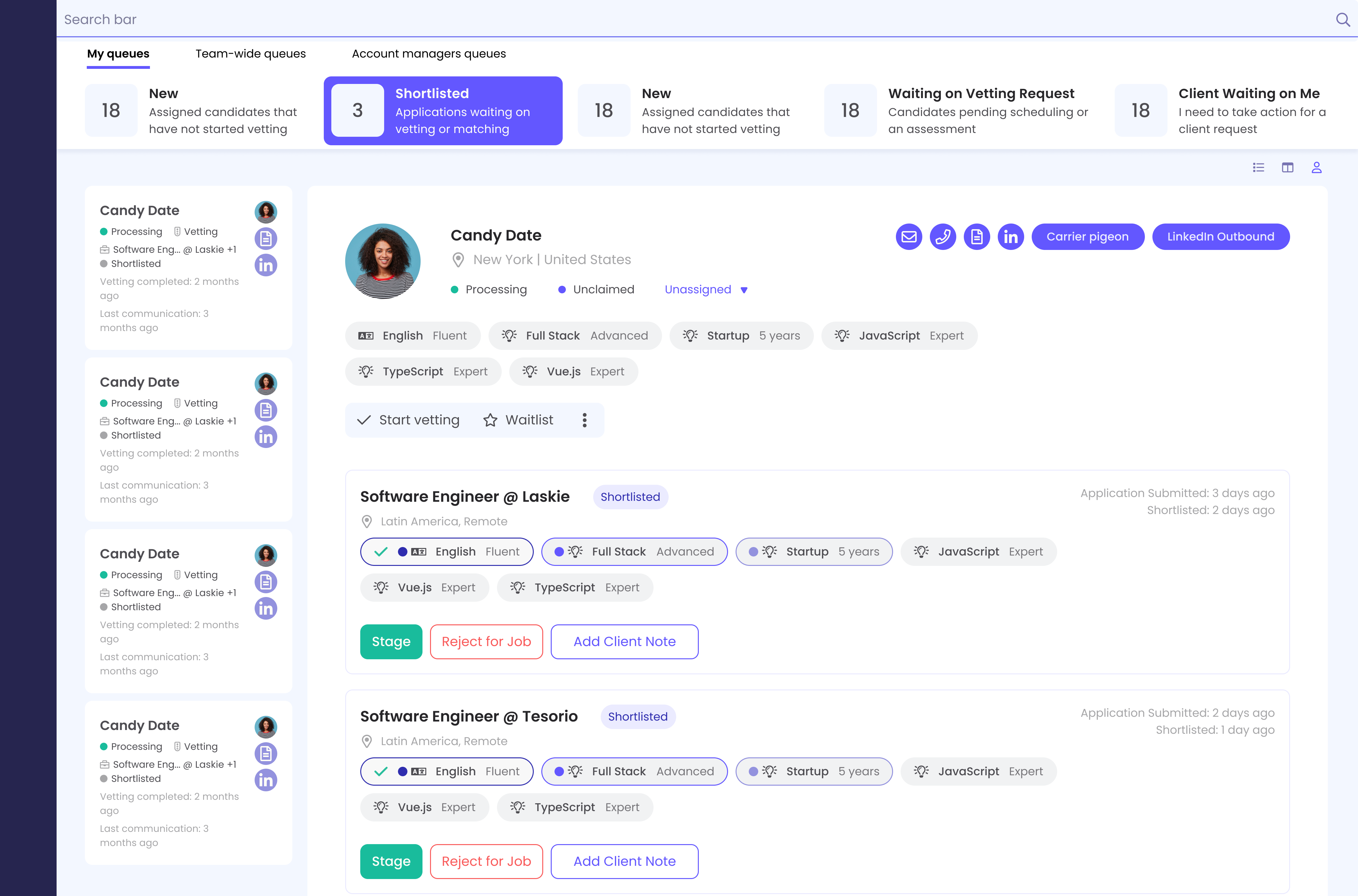
Simpler navigation
Talent Partners moved between vetting stages all day, but the platform gave them no way to do it without leaving the page. Engineering and I built the navigation: every stage (New, Shortlisted, Waiting on Vetting Request, Client Waiting on Me) one click away, with more of the data they actually use surfaced at each step.
Beyond the platform — the brand layer
Alongside the platform work, I built the reusable components and visual assets that kept Laskie consistent in product and social — the brand layer that ships only when someone tends to it.
Takeaways
What this project proved
Key Takeaway
Fast design with discipline starts with the 80/20 rule: prioritize hard, ship across the marketplace, then research what shipping couldn’t surface. In a team without time for a foundational research arc, that was the fastest path to design wins.