A crypto tool for Degens, by Degens
Creating a crypto analysis platform in just two weeks.
Background & overview
Khalo, a startup focused on helping and guiding investors by allowing them to make cualitative analysis,
decided to give it a shot in the crypto space, by designing a platform who could help Crypto Degens
analyse and compare the assets on the market.
The goal of this project was to initially create an MVP which would allow users to make fundamental
analysis of the different coins on the market.
My role
Design Lead
Research, visual design, prototyping & testing.
Bridge between Product Managers / Owners and Devs.
The challenge
The company needs a platform that could allow users with different levels of expertise, to make fundamental analysis of all the different coins in the market. The deadline was in only two weeks.
Understanding the problem
The empathising, defining and ideation phases of this project needed to be extremely quick and were anything
but linear, in fact it feels as if they were all meshed in one, as I only had two weeks to deliver.
Because the product owner and project manager were crypto degens themselves, I decided to make them my
provisional users.
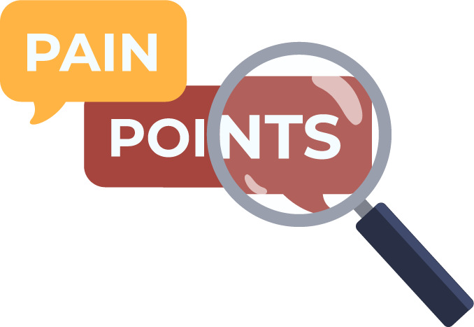
They already had some ideas in mind of the features that needed to be included, so my research mainly
consisted on uncovering their pain points they experienced while using similar platforms.
What I uncovered:
- Some of the main functionalities were hidden in sub-menus or throughout the different pages, thus making navigation complicated for users.
- It is difficult for beginners to understand what each of the concepts mean, or where each number comes from.
- Some pages are just saturated with information, and this makes it confusing for users as they do not know where to look at first.
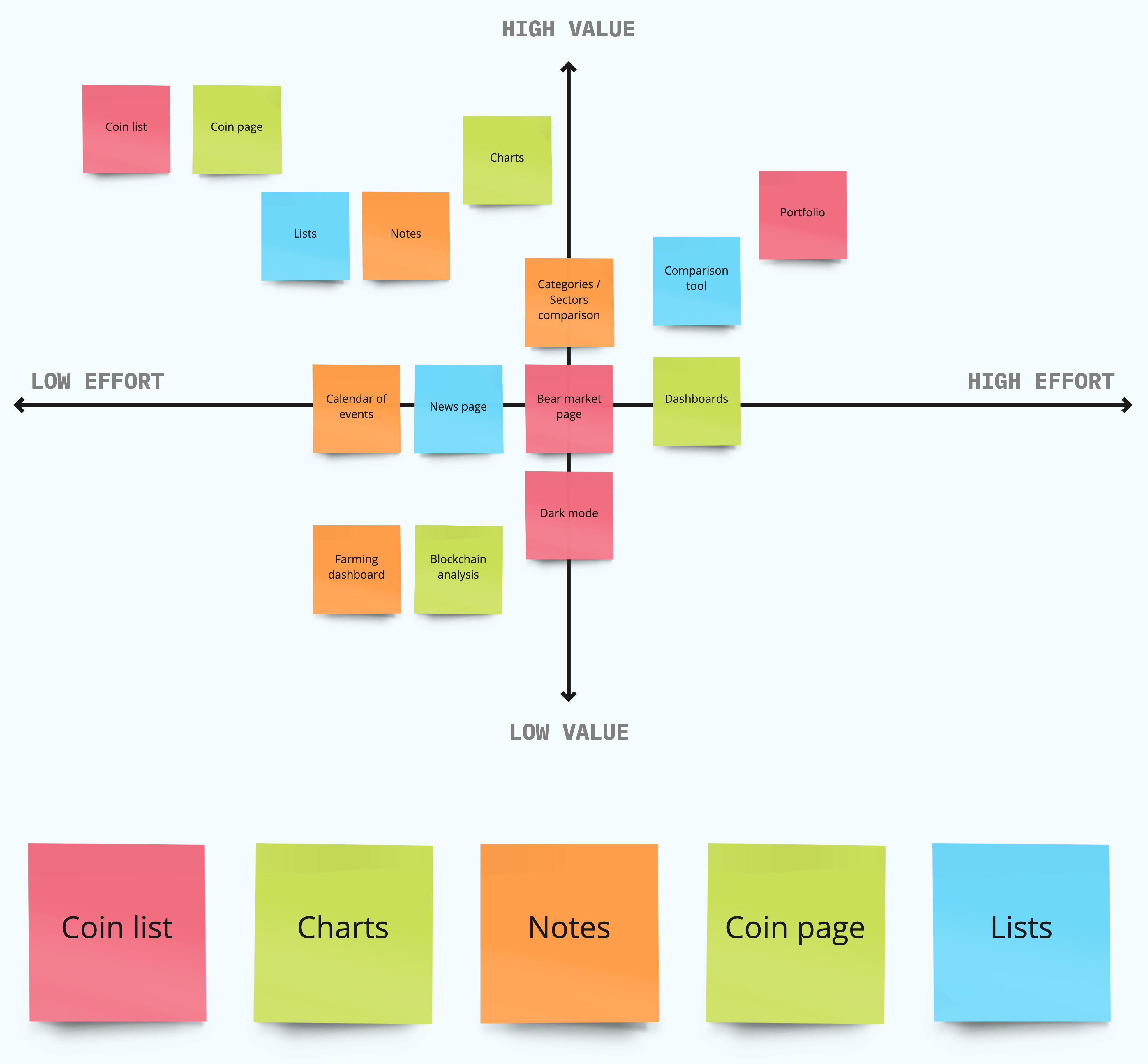
Feature prioritisation
Once the pain points were clear, the team needed to understand which were the main features they needed to create the MVP, and which were the ones we could save for later. For this, we needed to define the main activities the users should be able to perform within the platform:
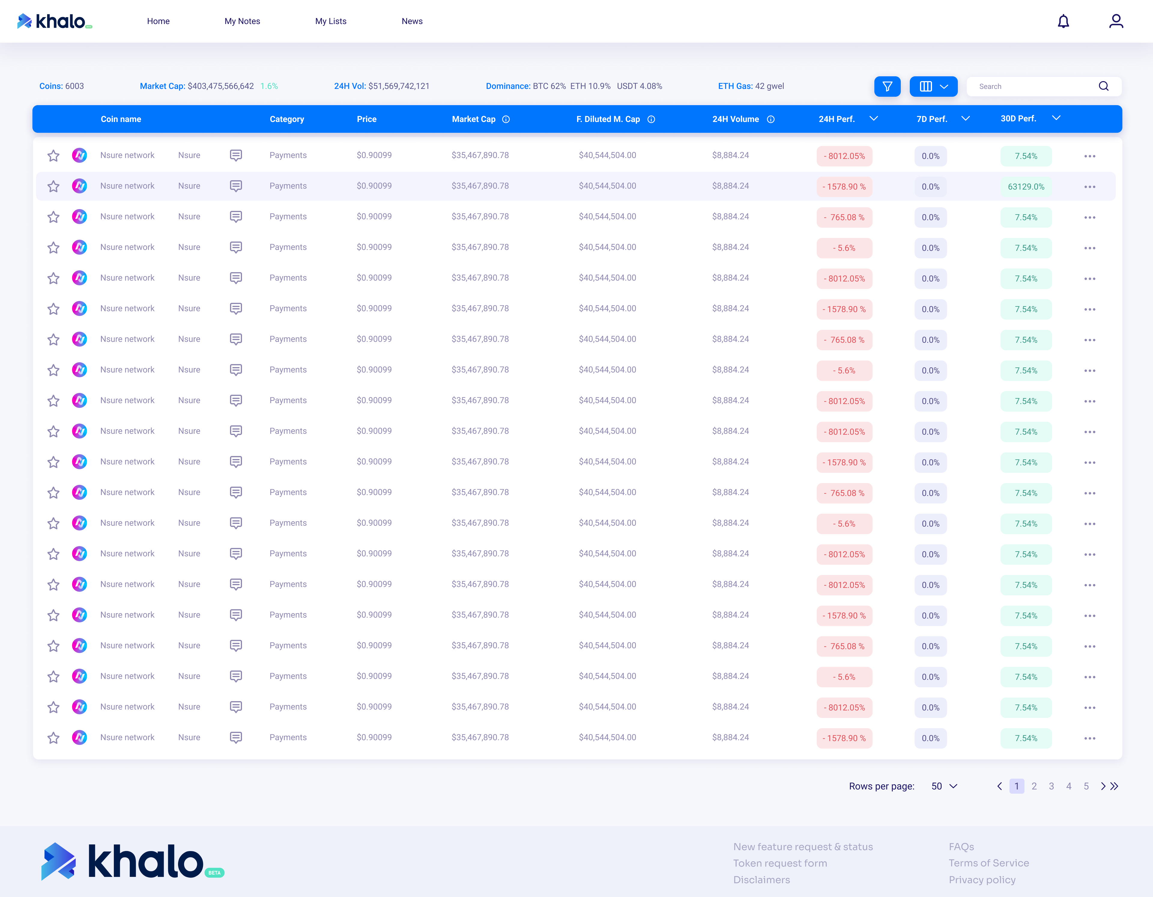
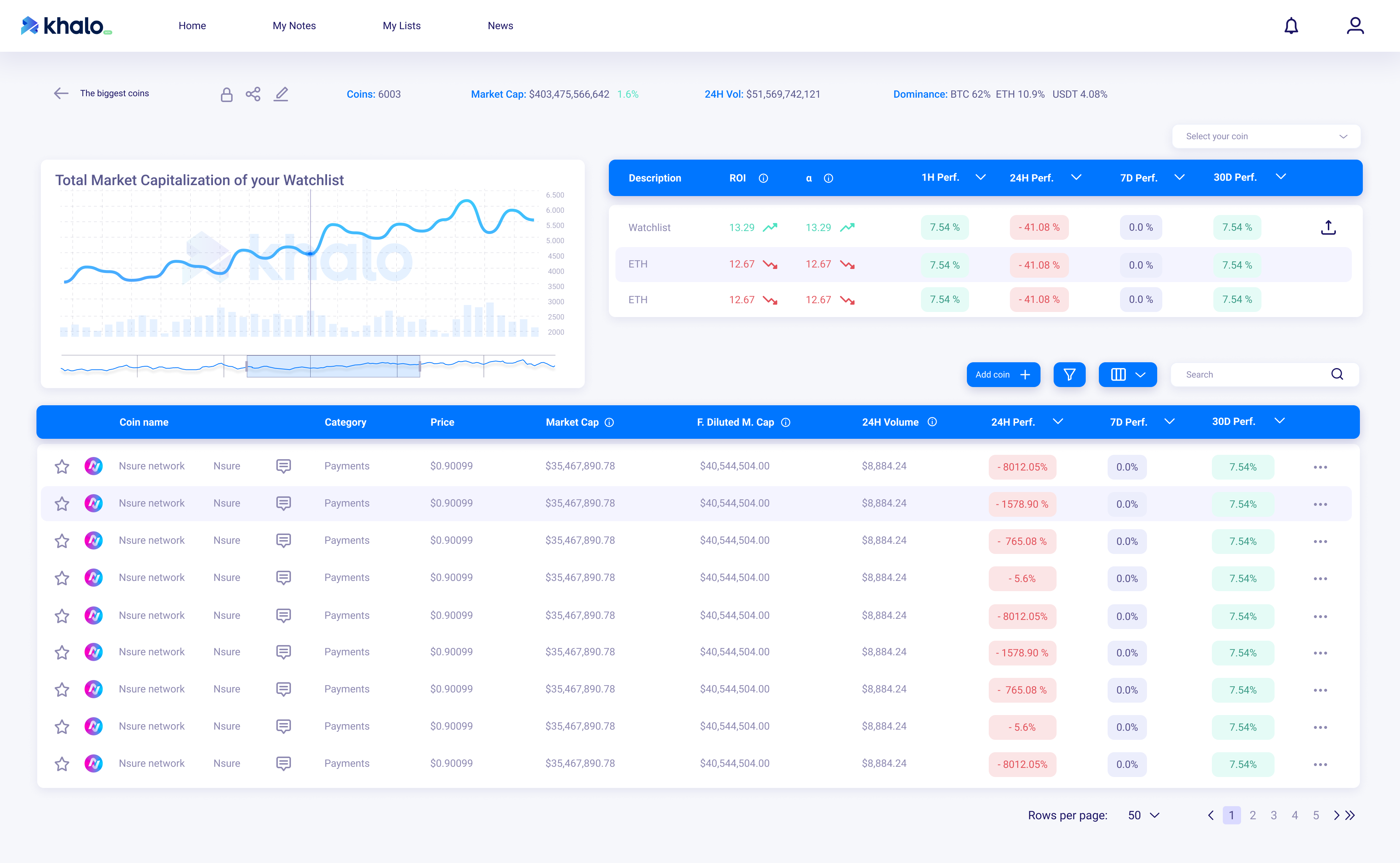
- View the list of coins in the market, along with their most important data.
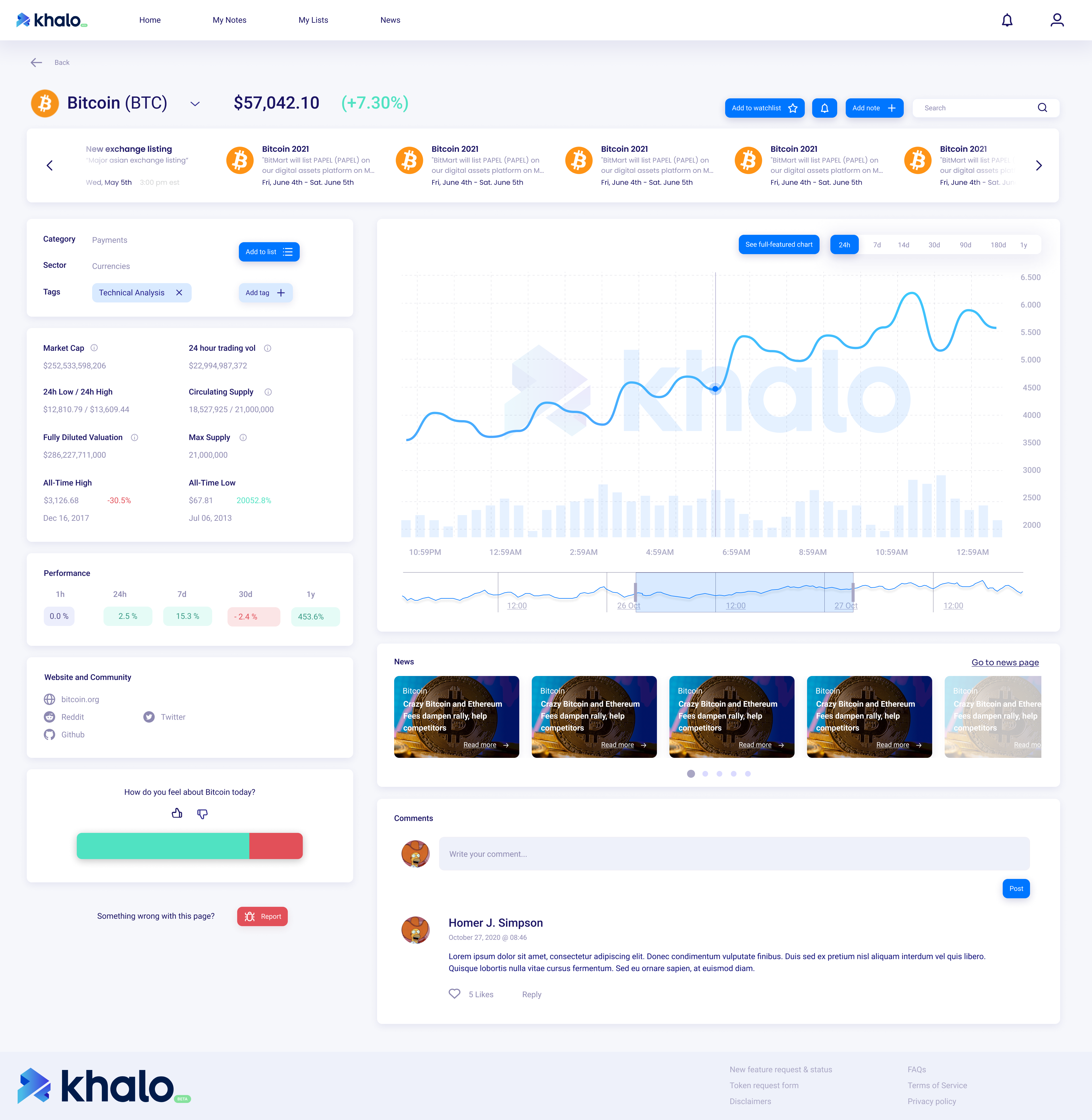
- Select a coin and visualise it’s details and price chart.
- View the detailed chart of the coin and be able to add and delete indicators.
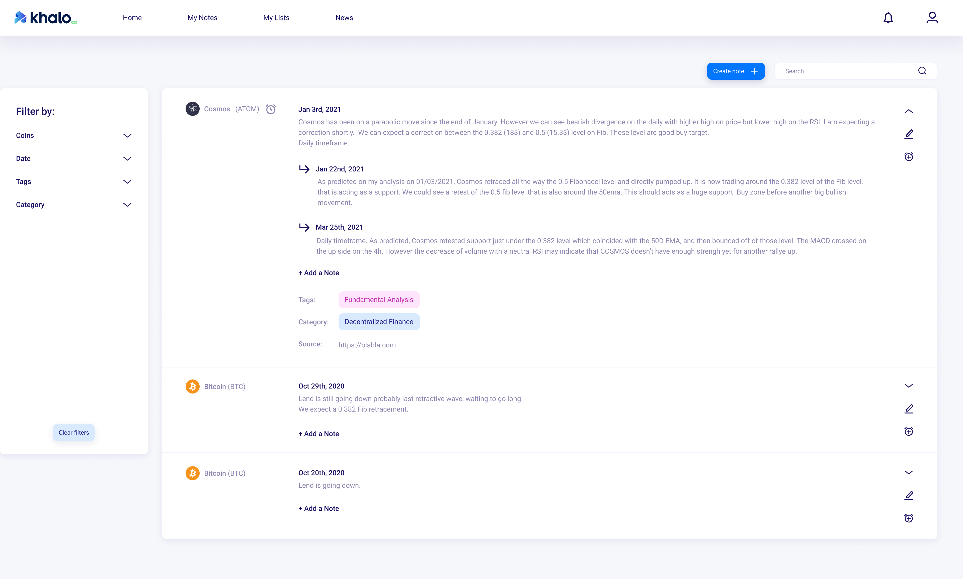
- Being able to view, add and manage notes / commentaries for each coin.
- Create and manage coin lists, and being able to add coins to compare them.
Once these features were defined, we jumped into the prototyping phase...
Prototyping and Testing
Based on the uncovered problems and the defined features, I worked towards addressing them with the following solutions:
- Having the main features always visible at the navigation bar.
- Adding simple tooltips that allow beginner users to understand the concepts.
- Reducing the amount of information noise on each page, by creating sections and reducing the amount of shown information.
I mocked up some wireframes in pen and paper to gather quick feedback from the Product Manager and Product Owner (my provisional users). Once tested, I then created a hi-fidelity prototype using Figma with the improvements gathered from the initial testing.
* Unfortunately, I decided to step aside from the project before starting the testing phase with actual users. For this action, we had decided to use Hotjar in order to track users movements, collect feedback and improve sections where they could get stuck.
Making improvements
Once the MVP was done, it was now time to go back and find ways to improve the design process for future features.
We incorporated two designers to the team, and UI inconsistencies while designing the new features could be perceptible. In order mitigate these, I came up with the idea of creating a Design System.
This system allowed us to create our Hi-Fidelity prototypes more easily, quickly and consistently. It also helped our developers, by having a guideline to follow when creating their components.
Key Takeaways
Prioritisation and comunication are key
My biggest fear and what made me the most nervous in this project was initially the limited time I had for research and execution. Even though I thought I would feel overwhelmed in no time, that did not happen, mostly due to the good communication, organisation and clear goals we had as a team.
Keep looking for ways to improve
With this project, I learned that even if the developers are already working on your solution, as a designer you always need to be in the lookout for possible improvements.
With this project I learned to create variants and design systems in Figma. This at first seemed to be time-consuming, but in the long-run it helped the design team to create and edit more consistent prototypes in a shorter period of time.
Background & overview
Khalo, a startup focused on helping and guiding investors by allowing them to make cualitative analysis,
decided to give it a shot in the crypto space, by designing a platform who could help Crypto Degens
analyse and compare the assets on the market.
The goal of this project was to initially create an MVP which would allow users to make fundamental
analysis of the different coins on the market.
My role
Design Lead
Research, visual design, prototyping & testing.
Bridge between Product Managers / Owners and Devs.
The challenge
The company needs a platform that could allow users with different levels of expertise, to make fundamental analysis of all the different coins in the market. The deadline was in only two weeks.
Understanding the problem
The empathising, defining and ideation phases of this project needed to be extremely quick and were anything
but linear, in fact it feels as if they were all meshed in one, as I only had two weeks to deliver.
Because the product owner and project manager were crypto degens themselves, I decided to make them my
provisional users.
They already had some ideas in mind of the features that needed to be included, so my research mainly
consisted on uncovering their pain points they experienced while using similar platforms.
What I uncovered:
- Some of the main functionalities were hidden in sub-menus or throughout the different pages, thus making navigation complicated for users.
- It is difficult for beginners to understand what each of the concepts mean, or where each number comes from.
- Some pages are just saturated with information, and this makes it confusing for users as they do not know where to look at first.
Feature prioritisation
Once the pain points were clear, the team needed to understand which were the main features they needed to create the MVP, and which were the ones we could save for later. For this, we needed to define the main activities the users should be able to perform within the platform:
- View the list of coins in the market, along with their most important data.
- Select a coin and visualise it’s details and price chart.
- View the detailed chart of the coin and be able to add and delete indicators.
- Being able to view, add and manage notes / commentaries for each coin.
- Create and manage coin lists, and being able to add coins to compare them.
Once these features were defined, we jumped into the prototyping phase...
Prototyping and Testing
Based on the uncovered problems and the defined features, I worked towards addressing them with the following solutions:
- Having the main features always visible at the navigation bar.
- Adding simple tooltips that allow beginner users to understand the concepts.
- Reducing the amount of information noise on each page, by creating sections and reducing the amount of shown information.
I mocked up some wireframes in pen and paper to gather quick feedback from the Product Manager and Product Owner (my provisional users). Once tested, I then created a hi-fidelity prototype using Figma with the improvements gathered from the initial testing.
* Unfortunately, I decided to step aside from the project before starting the testing phase with actual users. For this action, we had decided to use Hotjar in order to track users movements, collect feedback and improve sections where they could get stuck.
Making improvements
Once the MVP was done, it was now time to go back and find ways to improve the design process for future features.
We incorporated two designers to the team, and UI inconsistencies while designing the new features could be perceptible. In order mitigate these, I came up with the idea of creating a Design System.
This system allowed us to create our Hi-Fidelity prototypes more easily, quickly and consistently. It also helped our developers, by having a guideline to follow when creating their components.
Key Takeaways
Prioritisation and comunication are key
My biggest fear and what made me the most nervous in this project was initially the limited time I had for research and execution. Even though I thought I would feel overwhelmed in no time, that did not happen, mostly due to the good communication, organisation and clear goals we had as a team.
Keep looking for ways to improve
With this project, I learned that even if the developers are already working on your solution, as a designer you always need to be in the lookout for possible improvements.
With this project I learned to create variants and design systems in Figma. This at first seemed to be time-consuming, but in the long-run it helped the design team to create and edit more consistent prototypes in a shorter period of time.