Taking on the giant: ABInBev
Conquering a big corporation with a small design team, by re-designing and unifying their internal platform.
Background & overview
ABInBev is the is the World’s largest brewer, with approximately 630 beer brands in 150 countries.
The goal of this project was to redesign and unify their systems, which are currently scattered throughout several platforms, in order to help them create a more smooth and friendly experience for workers and improve their productivity.
My role
Design Lead
Workshop moderator, visual design and prototyping.
The challenge
The company needs to have the information, which is currently scattered through at least 5 different platforms, in a single place. There is no direct contact with Product Managers and users.
Figuring out the features
This is how features were discovered in this project:
Imagine being in a room, alone with your design partner. You both only have some pieces of paper, markers
and pens, your computer, and a door behind your desk. Suddenly, a bell rings and a piece of paper slides
under the door. You pick it up and it reads:
“We need a new feature.”
You look around confused. ‘Hello?’, you ask, but there is no one else to be
seen or heard. The only way to communicate is through these pieces of paper.
You sit down and write down a question: “What does this feature need to do?” and slide it back through
the door. No immediate response. After a few days, you get the note back:
“With this feature, users should be able to create an assortment. PS: We need the full prototype in two days.”
Woah! You have never seen an assortment before. You make a quick search, but there are no specific details. You write down again in your piece of paper: “What information should we display? Do they have something similar already working?”. A couple of hours later, the most feared reply:
“We don't know.”
Panic invades you, but you know you need to deliver. So what do you do? Just start sketching and prototyping.
This job consisted primarily on trial and error. No specs given, no immediate feedback, no questions resolved.
My approach: Just.Keep.Prototyping.

Sketch. Prototype. Iterate.
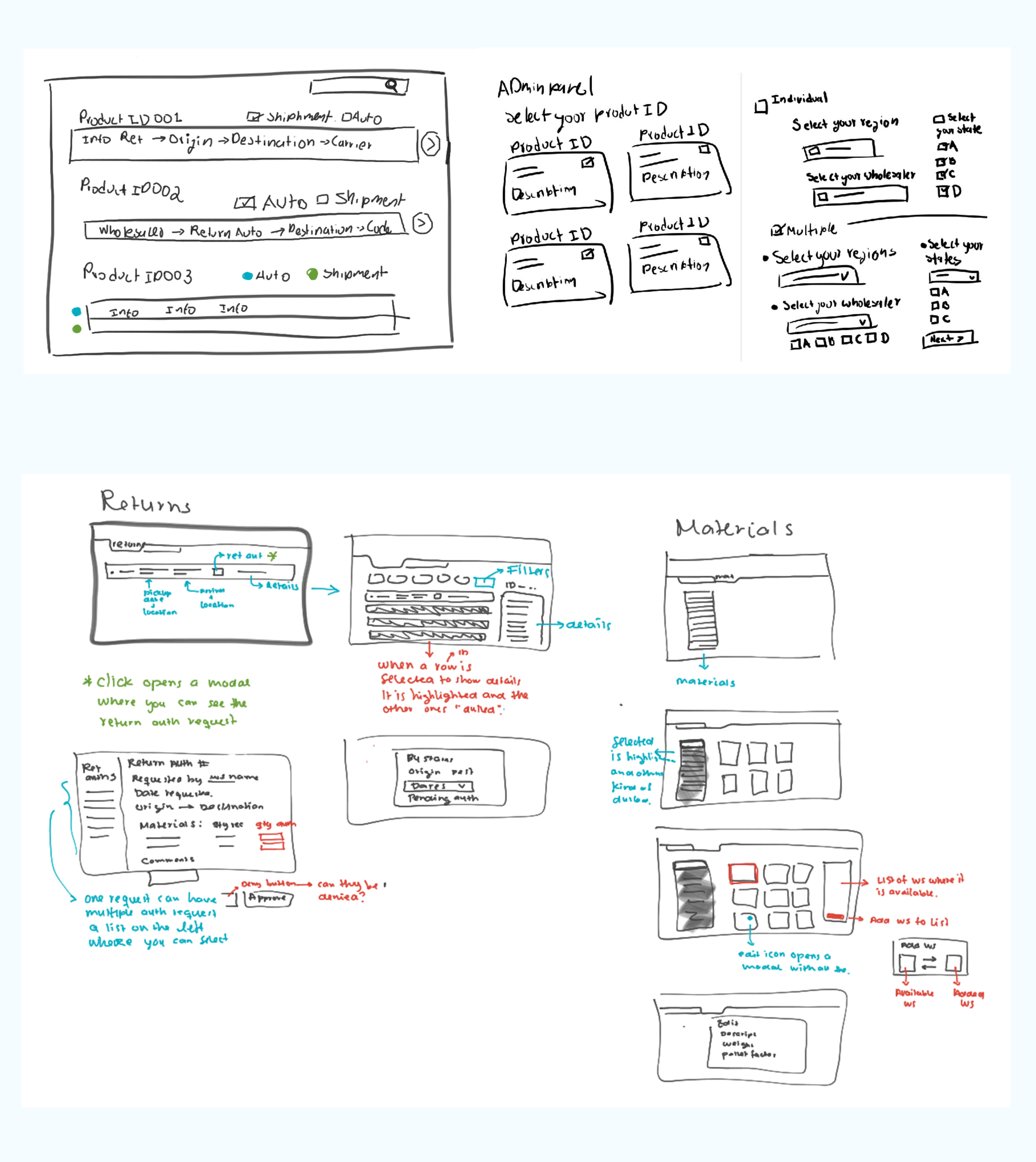
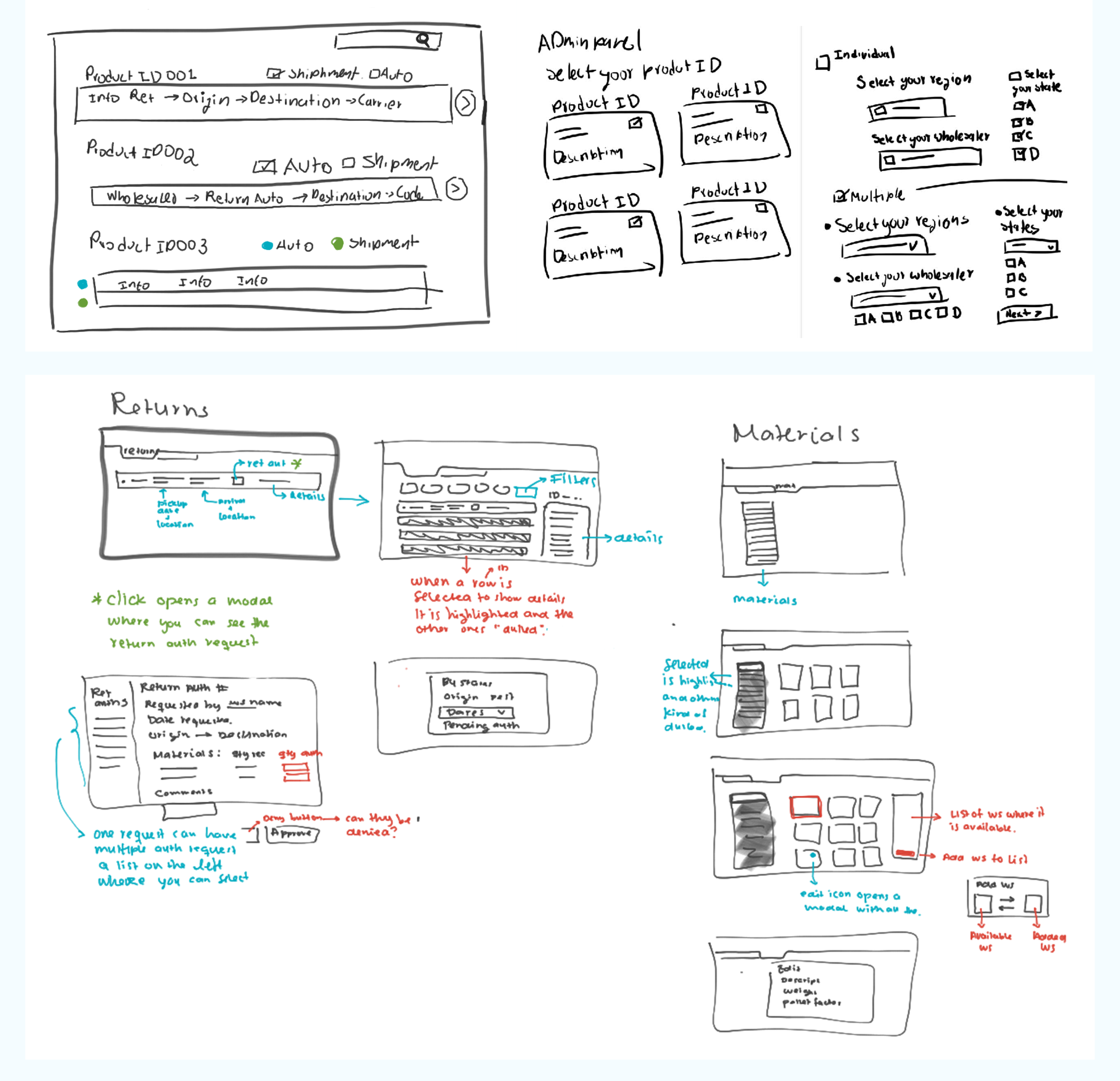
In order to create these prototypes, I decided that ideation workshops could be key. These workshops allowed the design team to come up with as many ideas as possible, in the shortest amount of time, and select the ones that seemed more accurate to tackle down the problem.
How they worked:
- The feature was put onto the table: Miro or Google Jam.
- We set a timer for 10 to 20 minutes, so the team was able to take a quick dive on the web.
- A very brief explanation of gathered insights was given by everyone.
- 20 minutes were then given for us to come up with as many ideas as possible.
- After sketching out our ideas, we selected the elements that caught up our attention, and that we thought could be able to solve the client’s problem.
- Once everyone was happy with the initial sketches, now it was time to transfer it all to Figma.
Once the first iteration of the hi-fidelity prototype was done, it was sent to review with ABInBev’s Product Owners / Managers, which would then send back feedback for us to improve. This iterative process would be done until it was fully approved by the entire ABInBev product team.
Key Takeaways
Prototyping is your strongest tool
Ranging from simple sketches to hi-fidelity prototypes, these were key to understand what the client really needed. By prototyping, we we able to discover what features users actually needed and which ones were discarded right off the bat.
Design systems make life so much easier.
In order to create these hi-fidelity prototypes as quick as possible, I developed a design system which would allow us to standardize our colours and components throughout the platform. One thing less we needed to worry about.
Background & overview
ABInBev is the is the World’s largest brewer, with approximately 630 beer brands in 150 countries.
The goal of this project was to redesign and unify their systems, which are currently scattered throughout several platforms, in order to help them create a more smooth and friendly experience for workers and improve their productivity.
My role
Design Lead
Workshop moderator, visual design and prototyping.
The challenge
The company needs to have the information, which is currently scattered through at least 5 different platforms, in a single place. There is no direct contact with Product Managers and users.
Figuring out the features
This is how features were discovered in this project:
Imagine being in a room, alone with your design partner. You both only have some pieces of paper, markers
and pens, your computer, and a door behind your desk. Suddenly, a bell rings and a piece of paper slides
under the door. You pick it up and it reads:
“We need a new feature.”
You look around confused. ‘Hello?’, you ask, but there is no one else to be
seen or heard. The only way to communicate is through these pieces of paper.
You sit down and write down a question: “What does this feature need to do?” and slide it back through
the door. No immediate response. After a few days, you get the note back:
“With this feature, users should be able to create an assortment. PS: We need the full prototype in two days.”
Woah! You have never seen an assortment before. You make a quick search, but there are no specific details. You write down again in your piece of paper: “What information should we display? Do they have something similar already working?”. A couple of hours later, the most feared reply:
“We don't know.”
Panic invades you, but you know you need to deliver. So what do you do? Just start sketching and prototyping.
This job consisted primarily on trial and error. No specs given, no immediate feedback, no questions resolved.
My approach: Just.Keep.Prototyping.

Sketch. Prototype. Iterate.
In order to create these prototypes, I decided that ideation workshops could be key. These workshops allowed the design team to come up with as many ideas as possible, in the shortest amount of time, and select the ones that seemed more accurate to tackle down the problem.
How they worked:
- The feature was put onto the table: Miro or Google Jam.
- We set a timer for 10 to 20 minutes, so the team was able to take a quick dive on the web.
- A very brief explanation of gathered insights was given by everyone.
- 20 minutes were then given for us to come up with as many ideas as possible.
- After sketching out our ideas, we selected the elements that caught up our attention, and that we thought could be able to solve the client’s problem.
- Once everyone was happy with the initial sketches, now it was time to transfer it all to Figma.
Once the first iteration of the hi-fidelity prototype was done, it was sent to review with ABInBev’s Product Owners / Managers, which would then send back feedback for us to improve. This iterative process would be done until it was fully approved by the entire ABInBev product team.
Once these features were defined, we jumped into the prototyping phase...
 A glimpse of the project
* I recommend opening the prototype on a desktop computer, as Figma does not make responsive prototypes.. Yet :)
Key Takeaways
Prototyping is your strongest tool
Ranging from simple sketches to hi-fidelity prototypes, these were key to understand what the client really needed. By prototyping, we we able to discover what features users actually needed and which ones were discarded right off the bat.
Design systems make life so much easier.
In order to create these hi-fidelity prototypes as quick as possible, I developed a design system which would allow us to standardize our colours and components throughout the platform. One thing less we needed to worry about.
